I drove through the high desert of Oregon for over 300 miles and the Blue Car was splattered with dead bugs. Not just a few splotches but a colony or a herd or whatever you call thousands of bugs. Enough bugs that I had to continually turn on the wipers to clear the windshield. When I stopped for gas, I saw my headlights were covered in black splotches and they got the squeegee treatment for safety reasons. The front hood was no longer a beautiful shiny “Prince Albert Blue” and the car looked like I drove through…well, I guess it looked like I drove through the buggy high desert of Oregon.
The state of the Blue Car really bothered me. I am proud of the 911 and driving into new places and meeting new people with this mess of a vehicle embarrassed me. Feeling this way also bothered me (it was just that kind of day I guess). Why should I care what this car looks like? Does it really matter what impressions strangers have when I pull into a new town? When I pump gas? When I park at the restaurant?
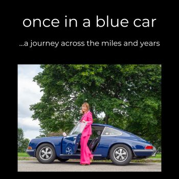
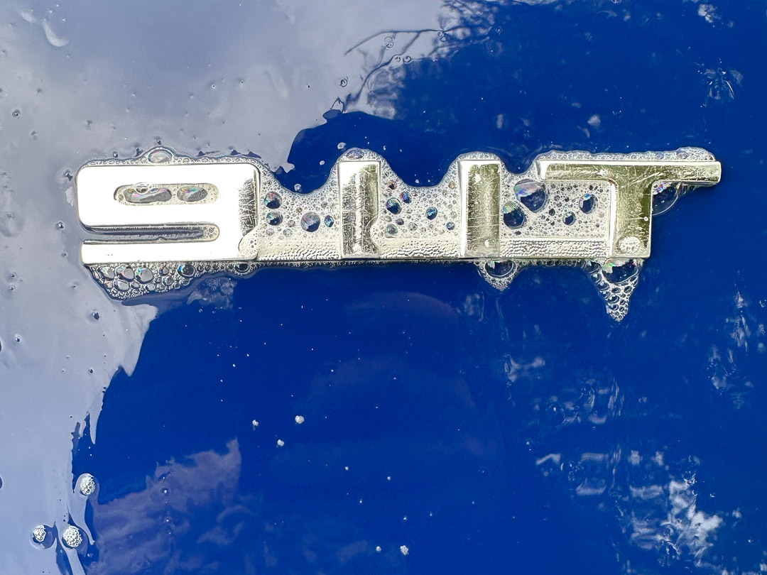
My answer to these questions is yes, it really does matter. The Blue Car is my traveling home (my tent, if you happened to read my blog article from a few weeks back) and we have a long history together; keeping it clean and presentable and yes, beautiful, matters. So, a day later, as the rain was coming down in buckets in the Columbia River Gorge, and I do mean buckets, I took advantage of this gift from above and washed the car.
While I was cleaning away all the muck, I began to think about the impressions I have had of all the ugly and unseemly things in the built environment during this road trip. Things like the endless billboards that have greeted me on arriving at most cities and towns (assuring me that I can get justice for my personal injury or talk to God by calling an 800 number). Or the too-wide streets through downtowns that made these places seem more like highways than communities. Or the lack of sidewalks and crosswalks and the presence of vast expanses of parking lots that made it difficult to walk from place to place when I got out of the Blue Car to stretch my legs.
I am not totally surprised by what I have seen; as an architect and city planner I have extended experience with beauty, nice materials, and good design being “value-engineered” out of civic projects. I know that cities and towns compete against each other for economic development, letting businesses and property owners take short cuts and do what they wish–ensuring everyone reaches the lowest common denominator for our built environment. So, while all of this is not new to me, two things really put this ugliness in stark relief on this trip. The first is that I am moving almost every day and the cities and towns across the U.S. are playing like a time-lapse video where I am seeing many places in fairly quick succession: the ugly and inhospitable environments are flying by me at a fast and furious pace. The second thing is that the contrast between our built-environment and the beauty I have seen in our natural environment is striking.
Badlands National Park is one of the most beautiful places I have been in my life. The rock formations and striations of color in the stark and unspoiled landscape are simply awe-inspiring while also being a bit daunting…a truly formidable yet breathtaking environment. The landscape around Badlands, as well as the gateway town leading to this national treasure are marred by dozens of billboards on the highway and vast expanses of parking lots, bad signage, and lack of crosswalks and pleasant public spaces. Some quick online research tells me that there are 300 Wall Drugs billboards in six states but I would put money on betting that 290 of them are in Minnesota and South Dakota and that I passed every single one on my way to Badlands. In Wall, South Dakota, the nearest gateway town to Badlands, I expected a beautiful place, particularly thinking that with over one million annual visitors to the national park, and more to Wall Drug, the town has enough of a tourist market to support a vibrant downtown. My city planner brain also assumed that the tourist commercial tax base would support substantial infrastructure and public space improvements (sidewalks, crosswalks, maybe a green space or two, and certainly nice signage). I was wrong. What I found were large surface parking lots ringing Wall Drug in the downtown, a lack of useful signage, wide roads with double parking lanes for Wall Drug, very few options for dining, and simply no sense of place. I could have been on any commercial strip anywhere and this seemed tragic given the proximity to Badlands…a landscape of stunning beauty and a place that was, and still is, considered sacred by Native Americans.
And shouldn’t all of our communities have an element of sacred and beautiful about them? Places we are proud of? If I lived in Wall, I would want an identity for my town. I would want visitors to see more than wide streets, parking lots, and one block of main street packed with four rows of parking. I had assumed that someone, somewhere in Wall would care what Wall looks like, what tourists experience, how other businesses might benefit from Wall Drug’s success, and perhaps even what Wall Drug might contribute to the beauty of the downtown. I guess I was wrong. And my first (and lasting) impressions of Wall have been duplicated many times over in the miles I have traveled so far.
This contrast between the natural beauty of this country that has left me awestruck, and the ugliness of many of the roadways, developments, and downtowns I have seen begs the question, “When did we as a society give up on beauty and good design as a civic ideal?” Beauty as something we should aim for, something we deserve? Because it does feel to me as we have stopped thinking about beauty and good design as something attainable. Perhaps because we think it costs too much or that good design and well-thought-out physical environments are for the wealthy neighborhoods, for those with excess money to burn, for the high-end shopping districts.
And it isn’t as though we don’t recognize and like beautiful buildings and walkable, interesting places when we see them. In my city planning work, I often began public meetings by asking people where they last traveled for vacation and why they chose that destination. It was a way to loosen up the crowd and to begin discussions of values and desires for their own community. The answers to those two questions were always illuminating because meeting attendees would excitedly tell me about the cities and towns they had been in and what a delight it was to walk and shop and dine and see historical sites. Or about the natural landscapes that gave them such joy. They talked about beautiful city parks, green spaces, and public art. And then when we got to discussing their desires for their own community the tone shifted. These same people often made the assumption they couldn’t have those things they valued in other places, that beauty and good design and all the pleasant experiences associated with these things were unattainable.
But why are these things out of reach? Shouldn’t we expect and demand that our communities feel cared for, that they are beautiful, that they look like someone is paying attention? Shouldn’t we expect the places we live and work to offer the same delights for our eyes and senses that we seek in the places we travel?
I think we are often focused on the wrong thing. Many communities spend more time thinking about what they DON’T want rather than what they desire. It’s simply easier; being reactive is fighting against something you can see, or something that you can clearly imagine. It’s often as simple as stopping something. Being proactive is harder. It requires a bit of dreaming and soul searching and then it requires hard work to define goals and outline steps to get there. Without that hard work the default is a free-for-all which usually ends in chaos, with every business and national chain store adhering to their own standards and one-size-fits-all design without a care for local environment and conditions. That chaos gives us parking in front of buildings along downtown streets, signage larger than necessary, cheap building materials, and no sense of local identity. Again and again. Much of this has its roots in zoning which historically has been about keeping things out of neighborhoods; communities use zoning as a tool to block unwanted uses and densities but never have the follow-up conversations about what they DO want. I wouldn’t buy a car (not that I am in the market for a car) by identifying all the ones I don’t want and then leaving the car I get to the chance of the salesperson. Why do we decide what we don’t want in our communities and then hope that chance will give us good design, beauty, walkability, and vibrant downtowns? There is proof all around us that leaving things to chance never turns out well.
Early on this road trip, I drove into Cedarburg, Wisconsin and immediately saw that the community thought about what it wanted, that things weren’t left to chance. The signage for businesses and destinations all had a harmony in size and materials while offering a variety of styles that was pleasing to the eye; I looked at these signs closely because they were like works of art and had interesting details that caught my attention. I saw sidewalks and people strolling and I immediately wanted to park to explore the downtown. There were no parking lots in sight but there was signage that pointed me to public parking behind the buildings. While strolling along the main street, I enjoyed a feast for my senses because there was a constant rhythm of storefronts and civic buildings and houses with no breaks between them, no expanses of parking lots providing gaps to drag my interest away. Crosswalks were plentiful and I zigzagged back and forth across the street when something caught my attention. And each storefront was occupied. Cedarburg has standards for development and design that creates this harmony and a place that people want to be because the core of the commercial area is a National Historic District, but there are plenty of places that enact standards, that decide what they DO WANT, that aren’t historic.
On this road trip, I am on the lookout for the places that seem to get all of this right, places that have done the hard work of deciding what they want and then requiring it. They tend to be the places that are thriving…people and businesses flock there because they are good places to live and work, and people want to visit too. There are lessons to be learned from these places, lessons that can help other communities decide what they want, embrace good design, and then take the steps necessary to achieve their goals.
Back in the Columbia River Gorge, the rain poured while I gently rubbed away the muck and ruminated about these things I have seen in my travels. My efforts to rid the Blue Car of its dead bug patina were fruitful and in a short time I had my beautiful car back again. If only it could be so easy with our built environment…
Susan Silberberg, mile 197,080
